
Thinstroke joins Type Network
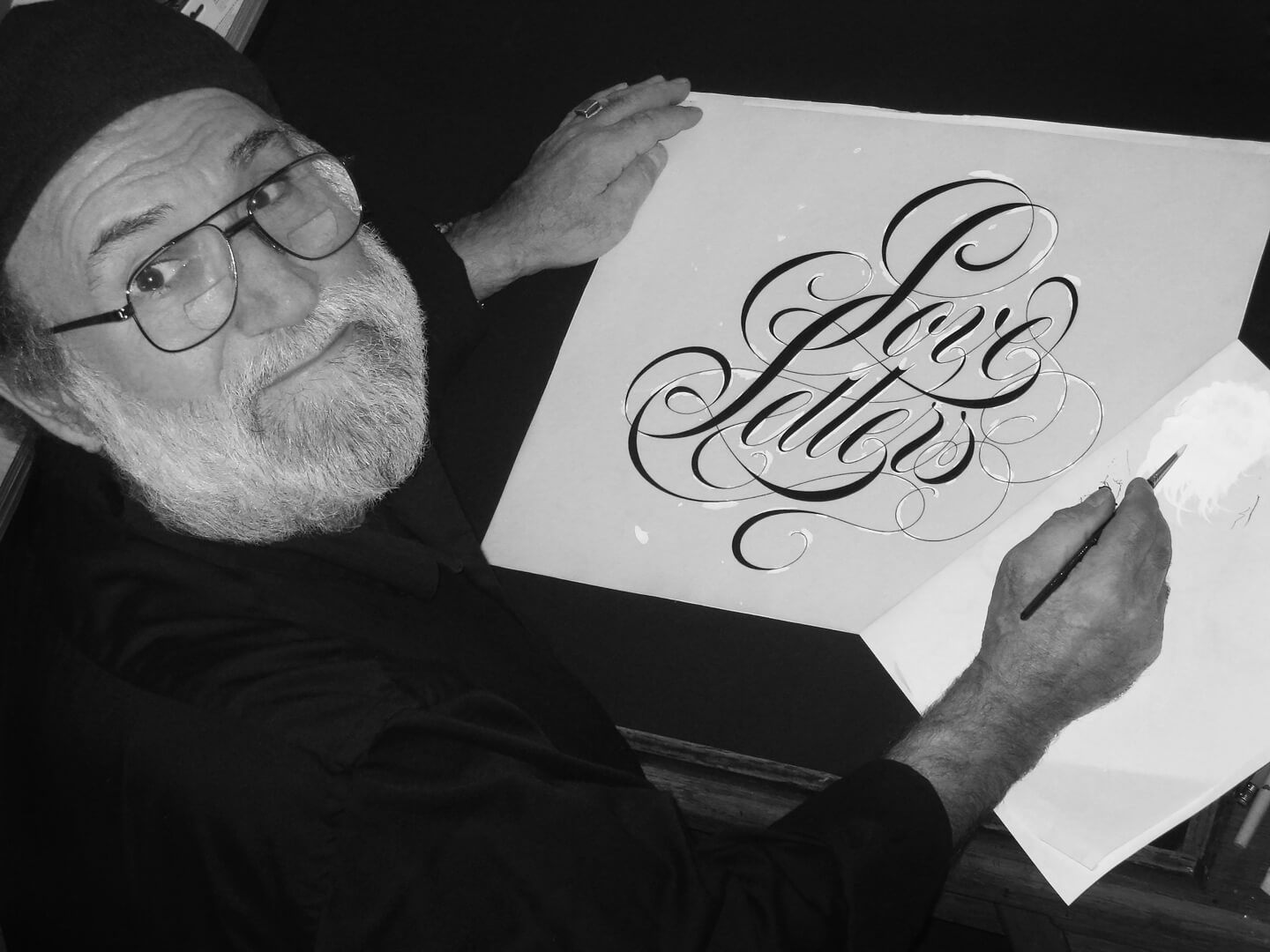
Di Spigna showing the process with ink and white paint
Tony Di Spigna and Bill Hilson met at Pratt Institute, where both were teaching in the Graduate Communication Design department. Di Spigna first attended Pratt in his youth, graduating first from New York City Community College in 1964 and then from Pratt in 1967. He returned as a professor years later, eventually achieving tenure and receiving the institute-wide Distinguished Professor Award.
Just after graduating from Pratt, Di Spigna discovered his love for professional type design, starting with ‘Fattoni’ in 1968. He put it on a strip of film for Typositor film typesetting and almost immediately, it was picked up by Herb Lubalin in several client designs. In 1969 he joined Lubalin, Smith & Carnase, designing in the same year a number of typefaces, Di Spigna Roman among the most successful.
Source: http://www.sci-fimovieposters.co.uk Lucasfilm Ltd. License: All Rights Reserved.
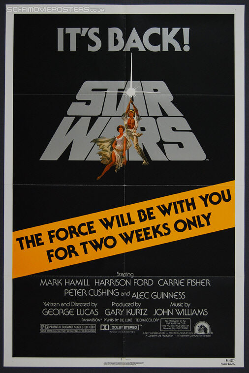
Di Spigna’s first published typeface, Serif Gothic (released by ITC), started as a scribble sketch for a French shirt company, HECHTER CHEMISE, a client of Herb Lubalin. The sketch made it into a presentation by Tom Carnase, but was rejected by the client.
During a rare slow day at the office, Di Spigna decided to develop and sketch the remaining capitals, adding a lower case and some alternate characters. In his free time, he decided to finish the design with ink and white paint. Despite it being Di Spigna’s first full typeface, Serif Gothic went on to become quite popular—in fact, it’s likely that everyone over a certain age in the United States has seen it, since it was used for the original Star Wars films’ posters.
These early works and Di Spigna’s experience with Lubalin shaped what would become the uniquely ‘Spignarian’ principles of Thinstroke: Each and every element of Thinstroke’s designs originates directly from an excruciatingly refined hand-drawing process. When you work with a Thinstroke typeface, you connect directly to Di Spigna’s vision, sensibility, experience, and history.
Thinstroke launches on Type Network with two typefaces: Spignarian Script and DiSpence Script.
Spignarian Script
Di Spigna’s self-titled Spignarian Script is the pinnacle of elegance. Penned by hand and refined over countless adjustments, Spignarian Script is a display face with true hairlines and smooth transitions from thick to thin, it works at sizes large enough to show off its detail.
DiSpence Script
An extremely refined and elegant Specerian design with marvelously thin strokes, DiSpence Script performs best at slightly larger sizes. Hand-penned by Tony Di Spigna, DiSpence uses true hairlines for the thinnest strokes.
“I’m very excited to have Tony and Bill joining us at Type Network,” said President Christopher Slye. “Their careful, hand-drawn approach is rare — even in our detail-oriented field. The precision and beauty of their work will be a great enhancement to what we offer our customers through our typeface library and services.”
All Thinstroke fonts are available for print, web, applications, and ePub licensing. Webfonts may be tested free for thirty days; desktop trials are available upon request. To stay current on all things Thinstroke, subscribe to Type Network News, our email newsletter featuring font analysis, designer profiles, type and design events, and more.